
Any time a client comes to us with a new logo venture, it is an exciting process for our entire team. We are often approached by individuals, startups and existing companies either looking to design or redesign their logo. Being responsible for a business’s image in regard to their logo can seem like a daunting task, especially when you know that a logo will be the public’s very first impression of a new business. While it presents its challenges, it is also rewarding.
Phase 1 – Client Discussion
One of the obvious challenges associated with designing a logo for a new business is that as designers, we first have to understand the brand of the business. We have to take the time to ask the right questions to truly understand our client and the brand they hope to achieve.
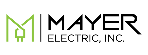
In the case of Mayer Electric, Inc., we were designing a logo for a startup business. The client provided services to residential, commercial and industrial customers, but wanted to place a particular focus on providing professional electric services to higher-end commercial and residential customers. The client was fond of the colors purple and lime green and wanted us to steer clear of the lightning bolt symbol that is often associated with electrician businesses. The client also desired to have an image in the logo that could easily be separated from the wordmark (like the Nike swoosh) to work alone on hats, apparel, etc. as people began to recognize the logo over time.
Phase 2 – Research
The next challenge is to research other similar businesses in the community and region. We work hard to make sure the logos that we design are not similar to another business – or worse yet, a competitor.
Phase 3 – Initial Drafts
Armed with this knowledge, we got to work. After much research, sketching and building initial drafts on the computer, 3 designers came up with a combined 40–50 initial concepts. We then spent time narrowing those concepts down to the strongest four logos, which we then refined in order to present to the client. We were aiming to create something that would stand out from competitors in Emporia, was clean and contemporary, while also reflecting the professionalism of the business. Below are the four designs that made the cut.
Option 1:
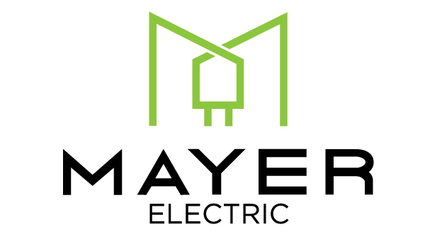
Rather than using a lightning bolt, this concept uses a power cord in the shape of the letter “M” to pull in the name as well as a visual representation of the business.
Option 2:
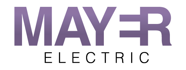
This concept uses just a wordmark to give the idea of power cord prongs that also make up the letter “E”.
Option 3:
This concept uses a very simplified version of a lightning bolt. It focuses more on giving a feeling of energy and electricity without obviously portraying electricity in an image.

Option 4:
The final concept was a play on the the letters “M” and “E” while also integrating a minimalistic power cord.

Phase 4 – Client Feedback and Revisions
Occasionally we have a client who likes multiple concepts and desires to merge them together. This isn’t always possible since we make sure the typefaces and logo elements we pair together really work with each other. In this case, we were asked to combine the image from the first concept and the wordmark from the third. Merging the designs required altering the image in the the first concept to carry similar visual weight and angles as the the letter “M” in the wordmark in the third option. All in all, we were able to pull it off.
Author: Courtney Huber
Sorry, comments are closed for this post.